
Mobile-First Index by Google was officially announced in November 2016.
At a recent 2018 Pubcon conference in Austin, Texas, Google Webmaster Trends Analyst, Garry Illyes, confirmed that the much-anticipated Mobile First Index (MFI) is likely to roll out imminently, within a few weeks.
With more and more searches coming directly from mobile devices, Google is now following a suit to represent this shift in trends and creating a separate mobile index as the primary source of all search results. In fact, Mobile traffic surpassed desktop traffic online way back. More than half of all online traffic comes from smartphones or tablets now.
(Source: https://www.vertical-leap.uk/wp-content/uploads/2018/04/desktop-versus-mobile-first-indexing.png )
In addition, 79% of global internet traffic would be mobile by the end of 2018, as per estimates. It is no secret that Google depends on the mobile interface, and understands its importance. Mobile is literally critical in the world today. However, simply having a mobile site is neither enough nor an afterthought; it is a priority.
So, are you all ready for the Google Mobile-First Index?
Mobile First Index – What is it?
(Source: https://www.seoeaze.com/blog/mobile-first-index-step-by-step-guide/ )
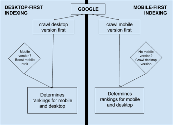
Firstly, Mobile-First Index aims to rank websites regarding how Google crawls the mobile version instead of desktop version. Google creates and ranks its search query listings based on content in the mobile version, which includes listings shown to the desktop. However, users can choose desktop version only in case if the mobile version is not available.
Google had to take timely action seeing the rise in mobile search queries. It realized that it is only sensible to favorize the large mobile user base and provide them with the best search results combined with the seamless user experience.
Until recently, the mobile ranking was based on desktop versions of websites only. Today, the mobile-first index represents a major shift with respect to how Google discovers, evaluates and prioritizes content.
Google’s Viewpoint
John Mueller announced that Google has already started testing some websites within the mobile-first index and it showed how SEOs can identify if they have successfully made a transition. On December 15, 2017, after this announcement, businesses are more concerned about their identity.
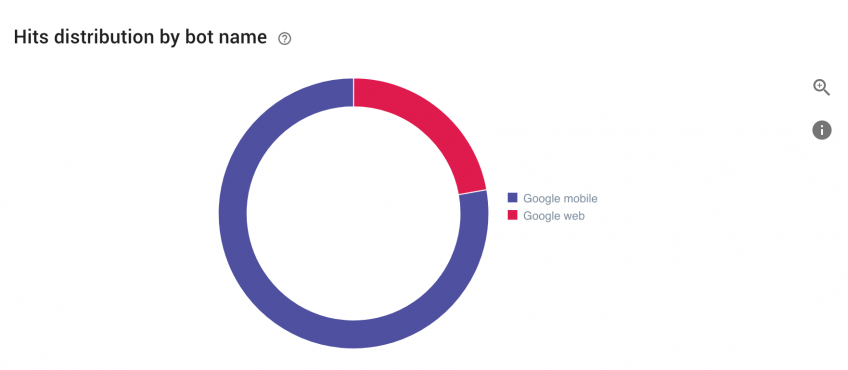
Mueller revealed that the log files could be a hint of the shift. Looking at the log files it may be possible to find something like 80% crawling is coming from Googlebot desktop whereas 20% is coming from mobile with smartphone Googlebot.
This trend, however, is likely to shift and most of the crawling would come from smartphone Googlebot and less from desktop Googlebot.
(Source: https://www.oncrawl.com/oncrawl-seo-thoughts/get-ready-google-mobile-first-index/ )
In the web business, it is a known fact that monitoring log files is essential for an accurate overview of website behavior and search engine crawling. Log files do not necessarily have to be technical. Anyone can read log files using a log file analyzer that presents a user-friendly and clear picture of everything happening. If you see a clear shift related to the repartition between Google desktop and mobile, it is likely that you have already been moved to the mobile-first index.
Preparing for Mobile First Index
Google shared some recommendations regarding the new method to index websites. If your website is still not mobile ready, nothing to worry. The search engine would crawl the desktop version.
(Source: https://torquemag.io/2018/06/google-mobile-first-index-wordpress/ )
On the other hand, if you already own a mobile version, make sure the content and links are similar to the desktop version so that Google continuously ranks the website as it did with the desktop version.
It is very important to optimize content organization on the mobile version. Google clearly stated that expandable content such as boxes, tabs, or accordions could be some of the valuable solutions for enhanced user experience; it is not regarded as having lesser content on each page.
The easiest way of keeping the same amount of content is to have a responsive approach. Following a responsive approach, it becomes simpler to maintain content on a page-by-page basis between mobile and desktop.
Although Google is tight-lipped about the real impact of the mobile-first index on rankings, it is likely to come along with a mobile-friendly update fostering optimized mobile results.
Therefore, here is exactly what you need to do right now:
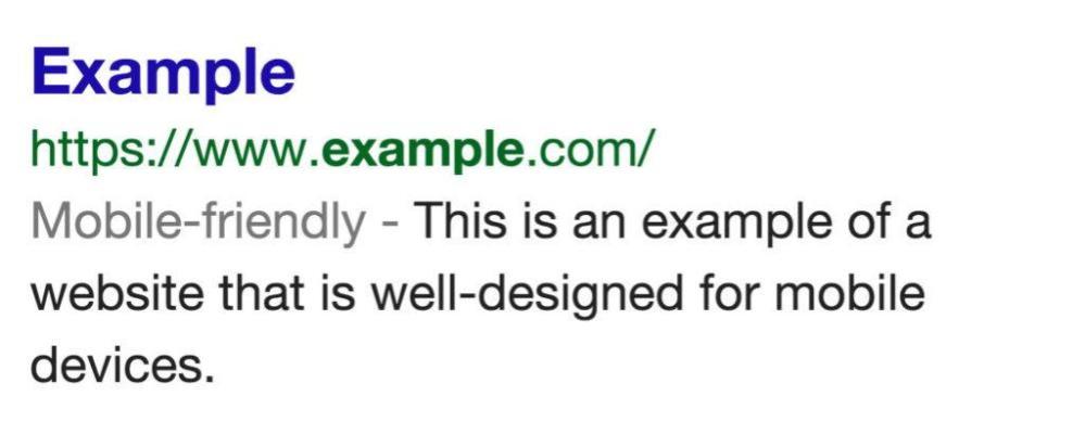
#1: Make it Mobile-friendly
It is crucial to have a mobile version of a website, for sure. However, it is more important to make it mobile-friendly. Now, there is a subtle difference between mobile-friendly and mobile-responsive sites. Although they sound and seem to be similar, they have some major differences that could negatively affect SEO in the mobile-first index.
Mobile-responsive websites are dynamic serving sites, having primary content that includes texts, videos, images, and other page elements, synchronizing dynamically between desktop sites and mobile sites.
Google always prefers responsive web design, which allows the servers to send same HTML code to all devices. Responsive sites can also virtually eliminate the most common issues with mobile user experience such as zooming, pinching, sprinting and similar annoying functions.
For instance, if you cannot see an image when you turn your phone into landscape mode is a sign that your site is not mobile responsive.
Contrarily, mobile-friendly sites have some user experience related issues. However, such sites allow dynamic content change when seen on mobile browsers, though it does not mean the content is mobile responsive. It simply indicates that you would not see a desktop version of the site on a mobile. Instead, you can see a mobile site, but with page elements impacted.
#2: Be Mobile Optimized
In today’s online world, you must aim to provide an optimal experience to your mobile users, way beyond the technicalities. You may make your website totally mobile-friendly and responsive, but still not provide the better user experience.
In order to cater to all the smartphone and tablet users, you have to examine the entire site through the eyes of the viewers and:
- Prioritize Content: Mobile devices do not offer much space for content. As a result, you should be sure to use the space well. Look at all the aspects of the content, including compelling text, videos, and images, and choose what is necessary and what you could avoid. Work on it.
- Mobile Usability: Mobile devices have certain mobile usability challenges, such as using your finger to operate them, instead of the mouse. Thus, it is crucial to offer a design that is finger-friendly and follows all the other important rules of mobile design. If you are adding sliders to the site, ensure it is usable on all mobile devices.
- Flat Site Architecture: User behavior changes the moment they shift from desktop to mobile. Having the same site design may not be equally useful for both platforms. In mobiles, screens are smaller, which makes people less inclined to click through all the pages to find what they want. So, be sure of that.
- Landing Page Optimization: It is not only important to scale down the mobile version of the site, but also essential to optimize it for smaller devices meticulously. Get the picture right – you have had a mobile-first approach to the site and see how it simplifies them and caters to users on all mobile devices.
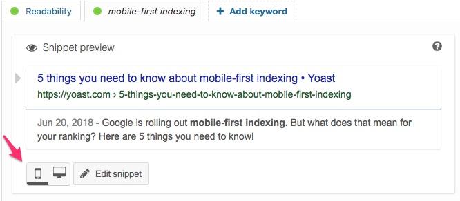
#3: Mandatory Mobile Snippets
Is your target audience mainly mobile? Do they come to your page from mobile search results? Do most of the organic traffic come from desktop SERPs? Use Google Analytics to check this properly.
If you are receiving most of the search traffic from mobile Search Result Page, ensure to optimize mobile snippet in the snippet preview.
(Source: https://yoast.com/5-things-about-mobile-first-indexing/ )
#4: Make the Mobile Site Stronger than Before
Mobile sites are a necessity for businesses today. Therefore, website owners should start taking better care of mobile sites.
Mobile sites cannot be a secondary afterthought any longer. It is not optional for companies reliant on inbound traffic for leads and sales.
If you are not bothered about organic search or reliable inbound leads, and you are only relying on direct referrals, you may ignore this. The percentage of such website owners is minuscule.
To move ahead in this game, the only step you can take is to make your mobile site robust and stronger.
According to a report published in 2017 highlighting Google mobile benchmarks, the majority of the sites in every industry are at least three times slower than its best practice of three seconds. This happens because average mobile pages in any industry are of multiple megabytes. 500KB is the best price.
When you add seconds to the mobile page speed, you can expect a big rise in bounce rates. From 1 second to 10 seconds results in an increase of 123 percent in the probability of users bouncing. Speed directly impacts the bounce rate.
Another biggest culprit that slows down mobile sites is the big and uncompressed images. According to a mobile page speed report, having fewer images on mobile page ensures better conversion. Although you should not eliminate all images, it is worth noting that the number of images used, the heavier a mobile site becomes, and the slower it runs.
You can use Google’s Test My Site tool to analyze those specific areas of the mobile site that needs work.

(Source: https://www.searchenginejournal.com/site-ready-google-mobile-first-index/240927/ )
Conclusion
There is nothing to panic about the mobile-first index rolling out. If your website features responsive design, content is similar on the desktop version and mobile site, and if both are scalable, you are good to go.
Although changes are simple, it is a grand venture. Therefore, you must prepare to make your mobile site more responsive, faster, and ready to roll. If you delay, your rankings may be hit.


Hello,
It was a very nicely written article. I like to read it. It was totally informative and topic you covered here, I am totally agreed with you. I must say that I have learnt so many things from it.
Thank you for sharing this article. Keep writing. Thank you so much.
Thank you for sharing your knowledge.
Nice post and helpful also.
keep blogging