The use of mobile devices has been on the rise lately. After the launch of smartphones, a wide number of web browsers depend upon mobile phones instead of computers and laptops to access content on the go. As mobile phones are compact, easy to carry and easy to charge, one thing is for sure, that these devices are here to stay and advance.
As a greater number of people depend on their smartphones to access different websites, it has become important for website developers to design websites which are compatible with both desktop and mobile devices. Since WordPress is one of the most widely used CMS platforms for building websites, it offers endless opportunities to its users to make build websites which give their visitors great browsing experience. However, despite actively using WordPress for building their websites, a lot of people either avoid or are not aware of the option of making their website mobile-friendly. If you are one such user, then our below tips will guide you in making a mobile-friendly WordPress website.
- Use Responsive Themes
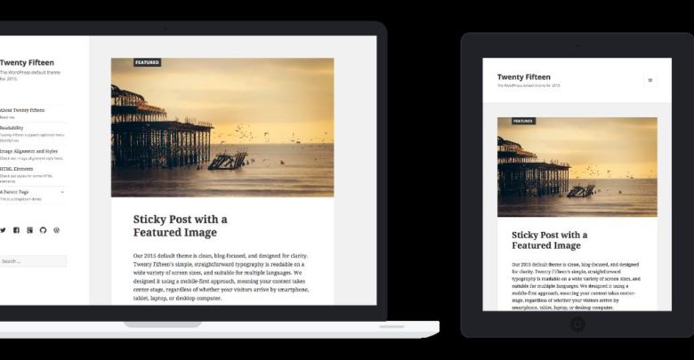
If you want to provide your audience with superior user experience while browsing your website on any device, then you need to select themes which are compatible with all mobile devices. These themes are also known as responsive themes as it makes sure that your WordPress site works flawlessly on all mobile devices. These responsive themes customize your website automatically to offer an optimal viewing experience and are faster to load on any device.


- Use Plug-ins
Like themes, plug-ins are essential to add functionality to any WordPress website. However, plug-ins play a huge role in websites which focus more on their content than its design. Plug-ins also add a physical element to your websites such as a widget or a Call to Action button which makes your website highly functional. While using a plug-in, make sure it is compatible with all screen sizes and comes with a disable option for smaller screens.
- Limit the Use of Elaborative Graphics
Although viewing graphics on the big desktop screen looks appealing, too many graphics on a mobile screen might degrade the viewing experience of your audience. Mostly, while building a website, developers ignore the viewpoint of their viewers and add various attractive graphics at different places to make the website appear engaging. However, while building a mobile-friendly website, experts advice to use minimal graphics which are easy to load and enhance the viewing experience of both the desktop and the mobile website.
- Use Proper Text
Similar to graphics, the text content of any WordPress website plays an important role in making it compatible with mobile devices. While there are unlimited text options available on WordPress, it is important to choose the style and font of the text which complements your website and is compatible with all devices. Additionally, the size of the text content should be selected appropriately to be easily readable on mobile devices.
- Avoid Using Pop-Ups
One of the best practices while making a mobile-friendly website is to avoid the use of pop-ups. Pop-ups are not only disturbing but they also frustrate visitors and makes it difficult for them to access the website content. Also, as pop-ups negatively affect the mobile user experience, search engines like Google have started penalizing sites which use of pop-up ads. Thus, to give your website visitors an easy and user-friendly navigation experience make sure to completely avoid the use of pop-ups.
- Avoid Using Flash
With the introduction of SEO and enhancement in the technology, the use of Flash has largely faded out. It is believed that the use of Flash slows down a web page’s loading time and is not compatible with a number of browsers and devices. Also, Flash is neither supported by iOS devices nor Android devices. Thus, if you create a website using a Flash animation, there are chances that your audience will feel left out. As a website which uses Flash do not open properly on different phones, experts advice to completely end the use of Flash on your website and rather find an efficient web design which can work even without Flash.
- Keep Your Design Simple
Often, to make our websites more attractive, we constantly look for themes which are either complicated to use or come up with a wide number of texts, pictures, colors, and various other elements. While these designs look good on a desktop device, they might create a mess on a mobile screen. Thus, while creating a mobile website, ensure that you use more simple and easy to load designs which makes your website user-friendly.
- Opt for Mapping
Mapping means adding an extra domain to your hosting account for users to seamlessly switch between desktop and mobile sites. For example, Facebook offers separate domains for its desktop and mobile users where the mobile website is termed by m.facebook.com. Similarly, you can also create a separate domain especially for your mobile users which gives them access to your mobile website. If you do not wish to invest money in buying separate themes or plug-ins for desktop and mobile website, then you can buy a separate domain for your mobile audience.
- Use Viewport Meta Tag
If you wish to have control on how your website appears on a mobile device, the make use of viewport meta tag. As the screen width of both desktop and mobile screens is different, a page opening up with the same width of the desktop site for the mobile can make it difficult for users to scroll from side to side of their phones to read each and every line on your website. As the viewport meta tag informs browsers to adjust the width of a webpage to exactly fit into the screen of any browsing device it is essential to include it in your mobile website.
- Perform Regular Mobile Testing
One of the best things which you can do to understand your website’s mobile experience is to regularly test it on your mobile devices. Try to frequently load your website on your mobile phone or tablet and spend some time on your website to see if there are any complications in the viewing experience of your website content. If you do not wish to hire a website tester, you can ask your friends, family members and colleagues to browse your website and suggest if they come across any flaws.


I like your post. It is good to see you verbalize from the heart and clarity on this important subject can be easily observed…