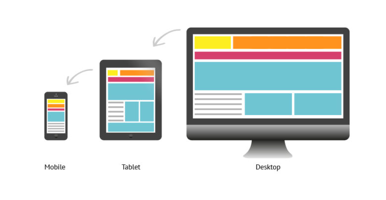
Have you ever thought about investing in responsive website design? Have you given a thought on the benefits that can be availed from a responsive website design? Here, in this article, our focus shall be on understanding a responsive website design and how as a business you can benefit from it. Responsive website design in the context of website designing can be considered a decisive move up the ladder. Talking about the history of responsive websites, it has to be maintained how the concept of a responsive website has always been there in the picture, but it was not until the middle of the 2000s when designers started to identify the many benefits of considering responsive websites. One of the key discoveries in the process was of the necessity of flexible layouts, if the website is to look and feel equally convenient in the desktop, the laptop, the mobile screen and tablets, all alike. Now consider the contemporary scenario. Gone are the days when people, if needed to access the internet directly had to find a computer, connect it to LAN and then access the internet. With the development of smartphones, people usually resort to accessing the internet via portable smart devices. People largely prefer to use their smartphones more than any other device to access the internet and hence the scenario is vastly changing. All these happened within a span of fewer than 7 years and it is ever changing. This has led to the potential growth of this sector and has witnessed the evolution of a new generation of designers focused on developing flexible layouts for their respective website to make sure that the access to their websites is as optimal in any device as it is from the computer, in a typical sense. It is almost as if it is acknowledging the fact that responsive website is the new best thing that can accommodate the changing milieu in the realm of the internet and websites.

With the help of responsive web design, you can drastically increase the amount of website traffic on your website-


Of late, through studies conducted on the World Wide Web, it has been found that in the last couple of years, and more than half of the traffic from all across the globe comes from mobile devices. This is not at all surprising given the fact people are heavily relying on smartphones and tablets to conduct most of the work that was earlier done on the computer. As a business with a website to play a crucial role in the process, it is important that your first step should be to find out the number of traffic on your website that comes from these mobile devices. These calculative steps are extremely essential for any business. After that utilize or deploy responsive design. Make sure that the website adapts to the viewport width. This will increase mobile visits.
The bounce rates are decreased-
With the help of responsive and optimized web design services in India, one can provide a much-enhanced user experience for a visitor. With enhanced user experience, they tend to stick around for a longer time and explore various aspects that your website has to offer. This is extremely beneficial for someone looking for higher conversion rates. When the website is not very responsive, it becomes difficult for one to keep a visitor intact to the website. They tend to bounce back. When you have a good responsive website, this bounce back rate is lowered.
Improved SEO-
Search engine optimization, in the contemporary digital world, has become a very important component. This is an integral concept. All websites strive for excellent Search result ranking. The higher the rank, the greater is the traffic, the greater is the conversion rate and the greater is the success of the business. In the contemporary scenario in the world of SEO, responsive web design is as crucial as good and quality content. Added to that, when you are using one single responsive website design, and not multiple versions of the same for different platforms and devices, the possibility of having duplicate contents drastically decreases which makes the website extremely unique and potent. This is very good for search engine optimization.
Faster web pages-
People always refer to the websites where the web pages can be opened real quick. Extensive installation time for web pages can deter the visitor from the website. If not paid much attention, speed can be a major factor deterring traffic of the website. Research has also shown that if the web-pages on a website take extensive time to be installed, they tend to leave the page real quick. This can be rather a major disadvantage for the business or the website. It is precisely at this juncture that the concept of responsive web design needs to be explored and talked about. The attention spans in case of mobile users are very less. Visitors are more likely to abandon websites and web-pages that tend to take a significantly larger amount of time to load. Navigation will tend to be a time-consuming deal if the website is not optimized for mobile devices. This makes the users lose interest and they quickly abandon the site. This is one of the many reasons contributing to the enhancement of the bounce rate. Slow, it can be concluded that the installation time is inversely proportional to the bounce rate with respect to a given website. It is precisely at this juncture that we need to talk about the importance if responsive websites. This is precisely why organizations must go for responsive websites.
In the context of responsive website designing, it becomes important for one to understand the concept of responsive website design. Let us analyze some of the key aspects of fluid grids. The following is a list of fluid grid facts that can be used to understand the very concept of fluid grids so that one is able to grasp the concept of responsive website designs in a much more comprehensive sense. Let us see them up-close
– In the case of web design, rudimental and basic responsive grids came up. The idea behind this was to provide aid and also frame to the designers and developers in the world of website design. After the development or initiation of these basic responsive grids in the world of website design, a wide array of responsive CSS frameworks came into existence.
-Fluid grids are exceptionally central to the concept and idea of responsive design. How does it really serve? These basically lets one align the basic aspects and elements on your page.
-These are laid in such a way that they seem to be visually appealing. A specific pattern of the hierarchy is observed here, in the process of laying out the elements and aspects of the page.
-By considering the size of the user’s screen, they scale and ensure that the page elements maintain and observe suit.
-One has to know, understand and realize that the utilization of fluid grids has always been integral in the realm of design.